What I like most about the cover of Love, Hollywood Style is what I love about all the covers: Walk into a bookstore, any bookstore, and you instantly recognize the books from the series. This is especially important since many different authors, with many different last names, write these books so they are shelved all over the young adult section.
The deceptively simple, classic designs from Amy Saidens and the Simon Pulse production team stand out against a sea of covers that, in many cases, are simply trying too hard. The Ro Com covers may seem modest in design, but as the other authors have already pointed out, they are filled with brilliant little touches from the stories. Don’t underestimate the value of a book cover that actually reflects the story inside. That doesn’t always happen in the publishing world (as seen recently with Justine Larbalestier’s Liar cover, where they initially used a model that looked very different from the narrator … to put it mildly.)
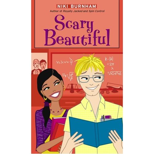
The colors pop off the shelf, but not because they are flashy. No angry streaks of red across a black background. No shiny, reflective foil embossing. All the covers are warm, inviting, and just a shade brighter than you might expect from the color choices. The covers work with the editorial tone of the Ro Com line perfectly. They’re fun and youthful and make for just the kind of book you want to curl up with in a comfy chair like in the cover of Aimee Friedman’s A Novel Idea.
In short, what I like about my Ro Com cover is pretty much everything.