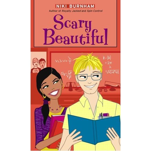
I know you’re not supposed to judge a book by its cover, but sometimes I can’t help it. More than once, I’ve bought a book by a writer I’ve never read before largely because of the strength of the cover art. Although it does help that the book is usually something I’m interested in reading. It’s not like I go around buying books that delve into the exciting world of tax law because there’s a stunning image of an abacus on the cover. Although abacuses are kind of cool. Or is the plural Abaci?
I love the look of the Ro Com line. The designer, Ann Zeak, and artist, Amy Saidens give it a great, distinctive style so that even though different people write the books—using different last names so we’re all over the YA section—you can always pick them out on bookstore shelves. Heck, other lines even mimic the look of this one. That’s always the sign of a true success.
I’m also very happy with the look of the DRAMA! series I write. My favorite part is how the four covers work together to tell a story. To see what I mean, click on “P.J. Ruditis” over on the side of the screen. I’ll wait while you do that. [Toe Tapping … Humming the original, far superior version of “Think of Me” than the one sung on IDOL the other day.] Welcome back! See what I mean? The curtain rises on the characters to finally reveal them (looking nothing like I imagined them, but whatever. That’s not the point.) I love the colors. I love the individual stories they tell and I love the full picture you get when you see the covers all together. Who could ask for anything more?
And while on the subject of covers, here are three books where the great covers drew me to buy books that I might not normally have picked up.
MIDNIGHT by Dean Koontz: When I was in high school (and he was still going by Dean R. Koontz), the art for this book--a moody cover shot of a town with a full moon overhead and a spooky bird flying across--led me to discover an author that I followed for years.
MASQUERADE by Melissa de la Cruz (from the BLUE BLOODS series): The haunting, white mask and painted face beneath makes it, quite possibly, one of the most beautiful covers I’ve ever seen. I loved it so much that I had to get the first book in the series just so I could read this one.
BAD KITTY by Michele Jaffe: It’s so sparkly! The hardcover released with two different cover jackets--one in black and one in pink--with a glittery, stylized image of a cat (that looked a bit like Boo Boo Kitty from LAVERNE & SHIRLEY). I would love to have a book with two different covers one day. That’s a commitment. Naturally, I went with the basic black. I enjoyed this book so much I literally fell off the couch laughing at one point. And I'm allergic to cats.
Sunday, April 27, 2008
Subscribe to:
Post Comments (Atom)


4 comments:
Oh, yeah, you DO have great covers! You are cover-lucky!
Right now I'm a total sucker for the current fashion: covers with photographs of people with their heads cut off. Some of my favorites are Sticky Fingers by Niki and Blacklisted by Gena Showalter.
Do others agree with me that, as authors, it's VERY rare to love your cover right off the bat? (unless you've been heavily involved in the process from the first instant--I know some authors who have even found their cover images!). Otherwise, it's a little bit jarring to see someone else's vision superimposed on your own...but I've also found that after a while you come to love the cover. I particularly love the cover of my most recent book, The Year My Sister Got Lucky--http://www.amazon.com/Year-My-Sister-Got-Lucky/dp/0439922275/ref=sr_1_3?ie=UTF8&s=books&qid=1209574605&sr=1-3-- and, of course, my Ro-Com! :) I agree that all the Romantic Comedy covers are amazing and adorable--some of the best in the marketplace, hands-down!
I think the Private covers are gorgeous, I looove the Luxe covers,and Pretty Little Liars. The cover of the new Meg Cabot book, Airhead, is also stunning!
I could talk about covers all day...does that make me shallow? :)
I have totally mixed reactions to my covers. I've been very lucky in that most of them I've loved from the moment I first laid eyes on them. Sometimes I've loved them at first, then had some second thoughts. Sometimes it takes some convincing. And on a very rare occasion there was one that I've never come around to. It's got to be hard to design covers since, as authors, we live with the images of these books in our minds for so long. How could anyone else perfectly capture them in one cover?
I've always suspected the trend in severed heads on covers is directly a result of the designers getting tired of hearing authors say (or whine), "But that doesn't look like my character." "Okay, then. We'll just chop off the head. Problem solved."
And if talking about covers all day is shallow, I don't want to be deep ... you know what I mean.
I love the Luxe covers too!
Students do pay attention to covers, and ANYTHING had to be an improvement on the 80s and 90s covers with murky, poor illustrations. There is a great web site that discusses just covers-- Jacket Whys. Very interesting.
Post a Comment